 creenwriting Fundamentals
For my Final Project, I chose to create a website for aspiring screenwriters seeking advice and skills to break into the film and television industries as professionals. As a use case scenario, I considered the needs of men and women in their early 30s, who have worked in professional environments but were seeking to transition into their “dream job” of screenwriting. I considered what understanding of workplace ethics and collaboration these individuals would bring to their work as a screenwriter, so I designed some of the text to speak to a professional mindset. I focused the skills I presented from the perspective of someone seeking to make a transition to from a hobby to an artistic profession, searching the site for what challenges they may face and what strategies they could employ to meet these challenges.
Thinking through the project from this lens informed many of the decisions I made in terms of style and layout as well as content. This is a process that I think will benefit me in the professional web design environment, because it forces me to consider the client’s mindset and needs at every stage of development.
Color Scheme
I wanted a color scheme that was bright and denoted a sense of fun, even though much of the content is designed to gravitate away from treating screenwriting as a purely creative hobby and focus more on the meeting the needs of industry professionals. I didn’t want site visitors turned off by a “strictly business” motif, but rather sought to present credibility to the site while imparting the sense that screenwriting is still fun and worth pursuing even when the business presents challenges to breaking in.
From a color perspective, that meant using a brighter color (I chose orange) as an accent color to stand out, then selecting a complementary blue and green for much of the site design. For my first pass, I tried out a color scheme that I eventually deemed too garish. See below for the initial version.
I eventually decided to keep the orange-and-blues combination but selected less saturated hues for a more relaxed and calming effect and a bit more brightness.
Typeface
I used Tahoma, a sans serif font, with a slightly larger-than-normal font size for the main content to make the text readable, especially on smaller format devices, and impart a bit of a boldness to it. For the headings and asides, I used a Courier typewriter font to emulate the standard screenplay format, which requires Courier.
Background
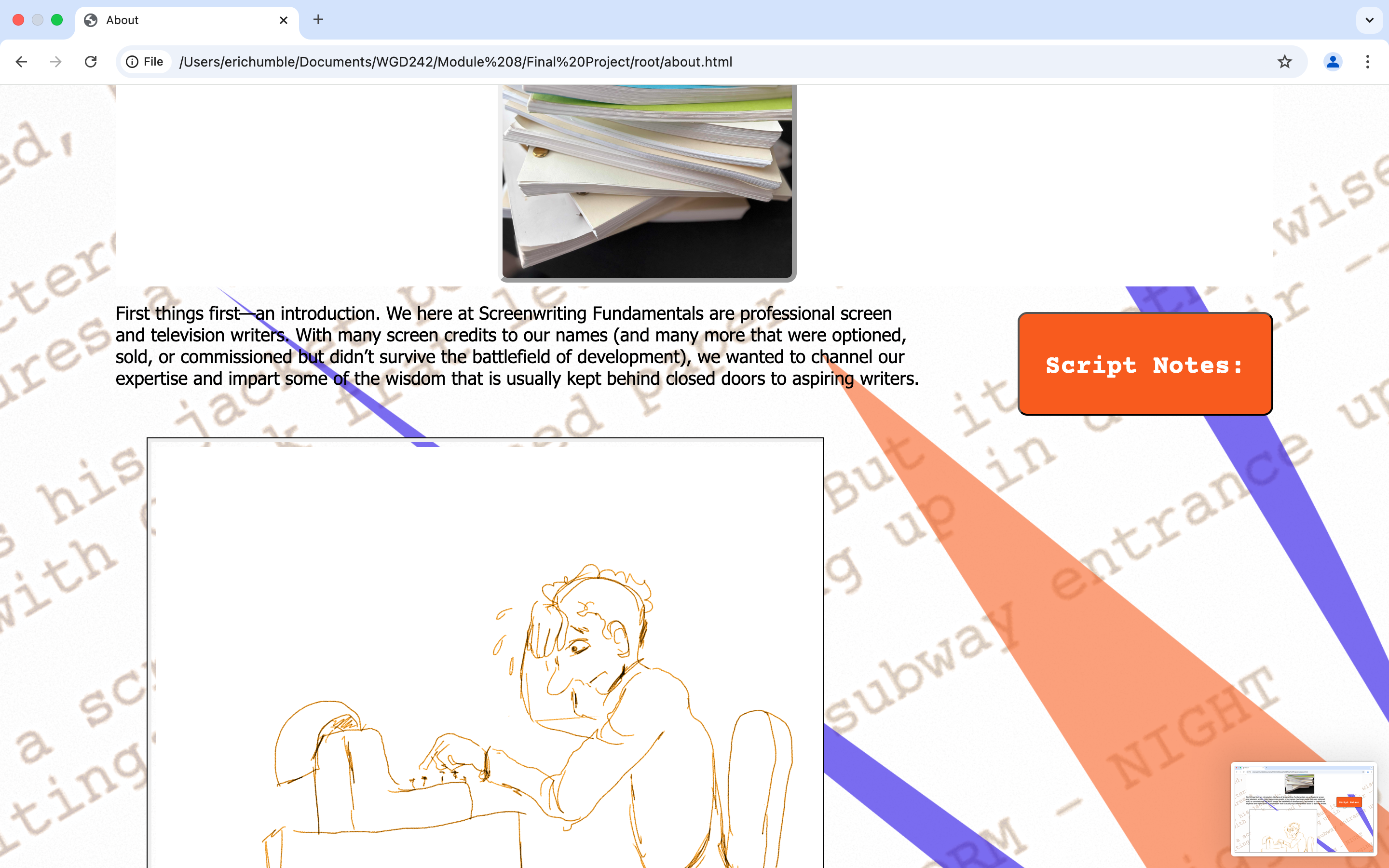
In the initial pass, I tried a background image of a large-scale blowup of a screenplay page set at a diagonal with some abstract shapes featuring the colors in the scheme running across it. I used a very light opacity so that it faded far into the background, but even so, I found it too distracting to the text, so I omitted it.
Eventually, I settled on a plain white background, again in part to emulate the feeling of a screenplay page, which typically contains a lot of white space and wide margins, and partly just to make the page less busy so that the images would stand out.
I decided to create a logo for the site in which the “S” from “screenwriting” is set into a receding circle that resembles a typewriter key. I used the three colors of the site in the logo for uniformity. On the header, I set the text against a hero image of a typewriter.
It may be a bit over-the-top on this site, but I wanted to practice creating a bold banner-type header, as I’m seeing this motif a lot on websites and I think it will be a style that’s in-demand, or at least an option I’ll want to present to clients for different projects.
The navigation bar features the names of the pages, with a drop-down menu on the “Structure” tab, listing the pages that deal with various aspects of screenplay structure. The menu buttons change from light blue to white on hover, and the words change from white to dark blue. I also included an icon of the logo which serves as another link back to the home page.
Following is a rundown of the pages of the site, how they relate to the theme, and what decisions went into their creation:
Design Elements
Landing Page
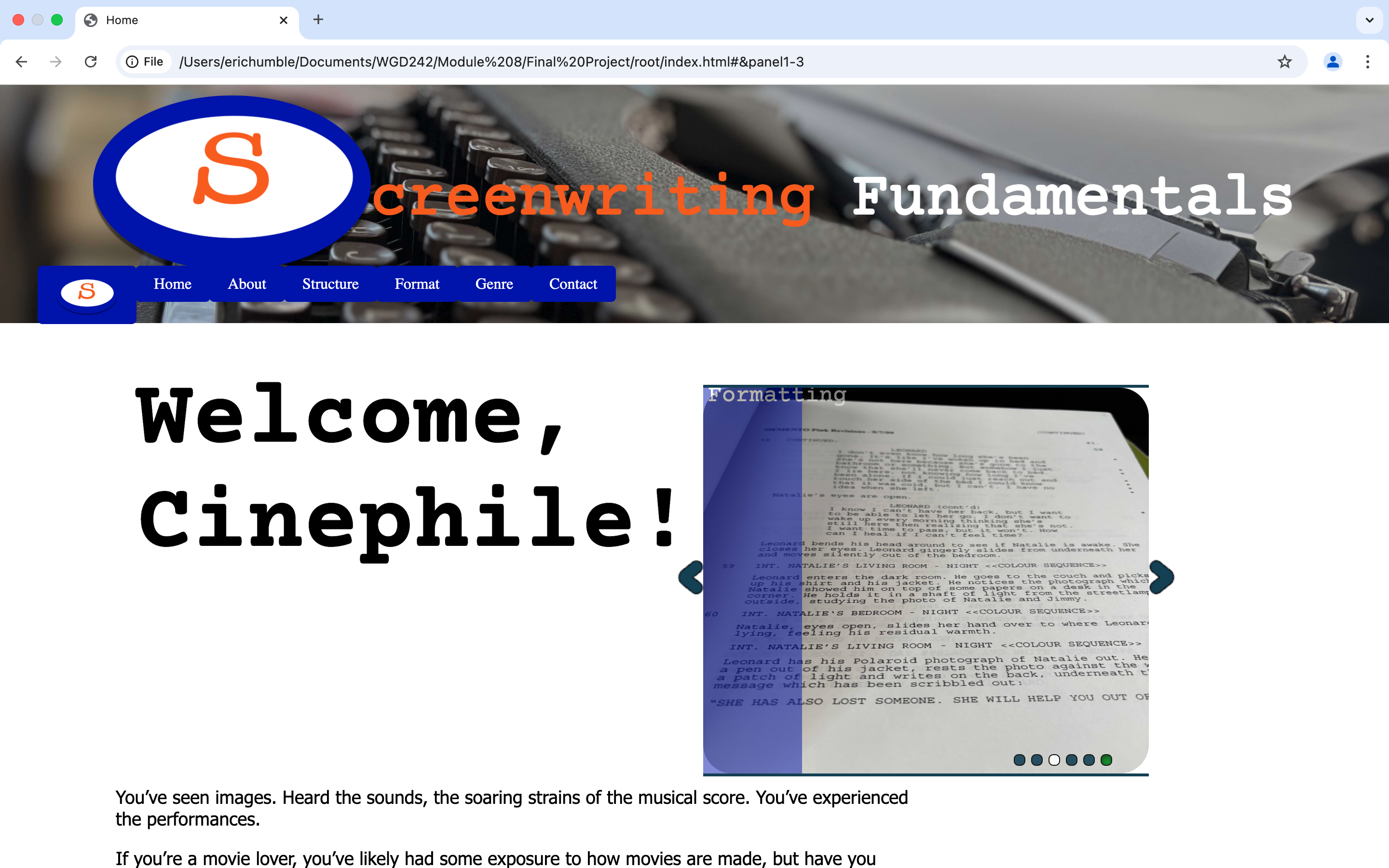
As with our projects in class, I opted to included a slider gallery on the landing page. I created some photos of screenplays in stacks, screenplay pages, a vintage typewriter (I own several), and a plaque with a quote from Hemingway. I made the slider smaller so that I could float it to right and leave the text to remain the focus.
I placed captions on the left side only against a translucent vertical stripe to make the text a bit more readable, then animated the color so that the stripe becomes opaque when moused over, improving the readability of the caption. The caption and the stripe then slide out when the panel loses focus. Each of the images in the slider also serve as a link so that when clicked, they take the user to that page.
About and Structure Pages
The About, Structure, and Format pages each feature the photo from the slider as a image floated to the right of the page title and text, in order to break up some of the white space and add some imagery.
For the About page as well as the structure pages, including those featured on the sub-menu, I added a sliding image, where the top image slides out to reveal another below. I created some humorous drawings to illustrate how the various structure points work and to add to the fun of the site. To further entertain the user, this effect is activated by clicking a button labeled “script notes.”
I used jQuery to create a function that ties this action to another effect wherein an aside box slides down simultaneous to the new image being revealed. The aside box is decorated to resemble a script cover bound with brads, the industry standard for printed scripts. Against this background, I added some text in courier font to provide writing prompts based on the skills the page presents.
Formatting Page
The formatting page is set up differently from the others in that we examine a sample screenplay page (from a script I wrote and to which I own the rights). I used jQuery to create an effect wherein when the user hovers on any line of text, an orange text balloon fades in explaining what that line represents in the screenplay, a definition of that element, and what the formatting of it should be. The balloon and text fade out when the line loses focus. I deliberately kept a good amount of white space on the margins of this page so that the user has the ability to mouse out without a constant barrage of text balloons firing wherever they happen to place the mouse.
Genre Page
The genre page is distinctly different from the other pages. For this, I used the scrolling page template we developed in class, but I modified it to feature information about the different genres and genre conventions which producers in the film industry are actively searching for in screenplays.
I created a design for the first page which features the names of the genres in an abstract arrangement with some other shapes at varying opacities. The concept of this design was to emulate a movie poster, signaling to the user that this page is different that the others for a reason, and to compel the user to scroll in order to learn more.
There is a set of horizontal scrolling slides on the slide featuring the definitions of the genre conventions.
The navigation menu for this section leads the user from one page to another of this scrolling page. I included the “S” logo as a link back to the home page and the remainder of the site.
Contact Page
Finally, there is the contact page, which features a form to leave comments and opt in or out to receiving a newsletter. I used JavaScript to create form validation for each of the form topics and styled the form background with the darker blue that is also employed for the footer on each page. The error messages are styled in a light pink to make them readable against the darker background.
To make the page responsive, I set up media queries at 670 and 1160 pixels. I collapse the navigation in to a single menu button which produces the menu as a drop down when clicked.
To make the site more readable and user-friendly, I hid many of the interactive elements and created static versions more suitable to simple reading. For the landing page, I omitted the slider gallery at the smaller screen size. For the About and Structure pages, I created a smaller, static version of the images and text on the html pages and set the display to “none” at the larger formats so that a user on a computer won’t see the static version, and will instead be able to activate the effects via the “script notes button” as described above. But at the smaller screen sizes, the button and effects panels are set to display: none and go away, which the static, stacked blocks of text and imagery become visible.
For the “Formatting” page, I created another version of the text and example on the html and hid it until the screen size decreases. At that point, the larger version with the animated text balloons becomes hidden and each aspect of the script format becomes visible as a block so that the discussion remains the same, but without the animation cluttering the smaller screen.
The genre and contact pages remain intact, with the controls able to be clicked or tapped on smaller devices.
The techniques and processes I used in creating this site are valuable tools I’ll be able to use to show potential clients what options are available for their sites. Using media queries to resize and reformat pages gives me the ability to create sites that work well on a variety of media while retaining the content and essential styles. The gallery slider is a great feature for a landing page to preview what the user can find within the site, and by making each image a link, affords the user the ability to jump right to the page that catches their interest from the slider.
I’m becoming more proficient in jQuery and jQueryui to the extent that I was able to create some additional functionality to add to the sliding image effect we made in class. This is a skill set I hope to expand, as it will allow me to work on the development side of creating websites and to create interactive mock-ups to present to clients.
The parallax scrolling pages are another variation of website format that can be attractive to clients, so it’s another good skill to have and to hone. The more I learn to create different page layouts and functionalities, the better I’ll be able to think outside the box to meet clients’ needs.